Visitor signage for a working wine estate
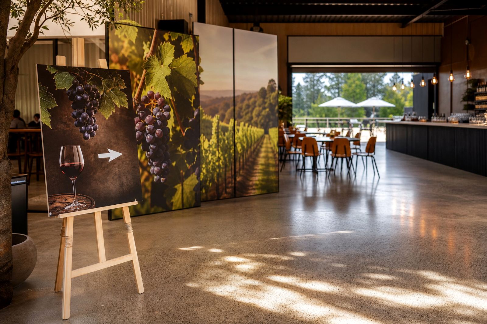
The brief came from a winery in Paarl that needed signage which looked polished but still felt practical for a site with constant foot traffic. The client wanted branded tasting room panels, directional boards for guests arriving by car and a few internal signs to help visitors find the correct entrance without asking staff every time. The estate wanted the finish to suit the setting, but the signs also had to stay readable from a distance and keep their colour in strong Western Cape sunlight.
We approached the job as a flatbed UV print project for rigid boards rather than a decorative exercise. That meant thinking about surface choice, fixing method, edge finish and how each panel would behave once installed outdoors and near busy hospitality areas where hands, dust and cleaning products are part of daily life. The result needed to be neat enough for a tasting room, yet practical enough for a working visitor venue.
- Client type: wine estate visitor venue
- Location: Paarl, Western Cape
- Signage use: tasting room branding and directional wayfinding
- Application: rigid boards for indoor and outdoor placement
What the site needed to cope with
Before printing, we looked at the main constraints. The signs had to work in bright daylight, in shaded areas under verandas and in places where glare can make light colours wash out. Paarl summer heat, winter moisture and general outdoor exposure all affect how signage ages, so the job needed a setup suited to those conditions. The client also wanted clean visuals without clutter, because the estate already had a strong physical character and the signage had to fit that rather than fight it.
There were also practical rules to follow on site. Visitor circulation had to remain open during installation, the signs could not interfere with doors, fire routes or staff movement, and the installation itself had to be completed with minimal disruption to tasting room operations. We planned the workflow in sections so printing, finishing and fitting could happen in a controlled order. That helped avoid delays and kept the site tidy. It also meant less handling of finished panels before installation, which matters when you want a clean edge and no marks on the face.
- Exposure: sun, wind and changing moisture levels
- Site access: active hospitality venue with visitors present
- Visibility: clear reading at short and medium distance
- Operational need: installation with limited interruption
Flatbed UV print process and materials
For this kind of signage, flatbed UV printing is well suited to rigid media because the ink is cured directly onto the board as it passes through the printer. That gives a firm finish and helps the printed image stay sharp on smooth sign substrates. We used a workflow that focused on colour consistency, correct panel sizing and clean registration across repeated directional boards so the family of signs looked like one system rather than separate pieces.
The print set included branded tasting room panels and wayfinding signs on rigid substrates selected for durability and neat presentation. We also looked at how each panel would be mounted, since fixing holes, hidden supports and exposed edges all affect the final result. In a winery setting the finish needs to be wipeable and dependable, because staff will clean around it and guests will often touch the signage when moving through the venue. The inks were chosen for strong visual impact and stable day to day use, with attention to both indoor colour and outdoor reading.
- Print method: flatbed UV direct to rigid board
- Media: rigid signage boards suitable for indoor and outdoor use
- Finish: clean, wipeable surfaces with durable colour
- Workflow: print, cure, trim, check and install in sequence
Install and training carried out over three weeks
The project ran over three weeks from site review to final handover. Week one was for measurements, layout planning and confirming the board sizes, fixing points and wording hierarchy. Week two covered print production, curing and finishing. Week three was for delivery, installation and a final check with the client team. Because the venue remained active during the work, we kept the programme tight and coordinated the timing around guest movement and staff routines.
We also talked through practical care with the people on site. That included how to clean the printed panels, what to avoid with solvent based cleaners and how to check fixings after weather changes. For a winery that hosts visitors daily, that small bit of guidance helps the signs stay neat longer and reduces avoidable damage. The client was pleased that the signs fitted the space without looking overdone, and the directional boards made navigation easier for first time guests. The work did not need any major rework, which saved time and kept the handover simple.
- Week 1: measure, plan and approve layouts
- Week 2: print, cure and finish rigid panels
- Week 3: delivery, installation and care guidance
- Handover: site check and sign-off with client team
Results on the ground
The final signage gave the tasting room a stronger sense of place and made wayfinding more direct for visitors arriving by car or on foot. The branded panels created a consistent look through the visitor area, while the directional signs reduced uncertainty at key decision points. That matters in hospitality, where a guest should know where to go without stopping to ask twice. It also helped staff, because fewer repeated directions means smoother front of house flow.
In practical terms, the signs held their colour and readability in strong light and still looked tidy after installation. The project showed how flatbed UV printing can support a site that needs both presentation and function. The boards had to be visible, but they also had to sit naturally in a wine estate setting. The final outcome achieved that balance without fuss, and the client could use the same visual language across more areas later if needed.
If we were doing the project again, we would keep the same approach: confirm the visitor routes early, test panel placement in relation to sun and shade, and allow enough time for a proper site check before final fitting. That is usually what makes these jobs work well. A sign can be printed quickly, but it only does its job when the size, position and finish suit the place it serves.
Why this workflow suits winery signage
Winery signage has to balance atmosphere with clear communication. Too little information and visitors get lost. Too much and the place feels cluttered. Flatbed UV printed rigid boards are a practical fit because they handle bold graphics, short messages and simple directional layouts without needing excessive maintenance. In a place like Paarl, where many venues mix indoor hospitality with outdoor movement, that combination is especially useful.
Our team handles installation, training and service across South Africa, including Germiston, Johannesburg, Pretoria, Durban, Cape Town and Gqeberha. For projects like this one, that national coverage matters because the same working method can be applied from one site to the next while still allowing for local conditions. Whether the job is a tasting room, roadside directional sign or internal visitor board, the focus stays on usable print, correct media and a neat finish that holds up in real conditions.
- Good fit for hospitality and visitor sites
- Useful for branded rooms and directional systems
- Can be adapted for indoor and outdoor use
- Supported by installation and aftercare across South Africa
Key facts
| Project | Paarl Winery Signage |
|---|---|
| Client type | Wine estate visitor venue |
| Location | Paarl, Western Cape |
| Scope | Branded tasting room panels and directional rigid signage |
| Process | Flatbed UV printing on rigid boards with site installation |
| Timeline | Three weeks from measure up to handover |