
Why Acrylic Changes the Way Colour Behaves
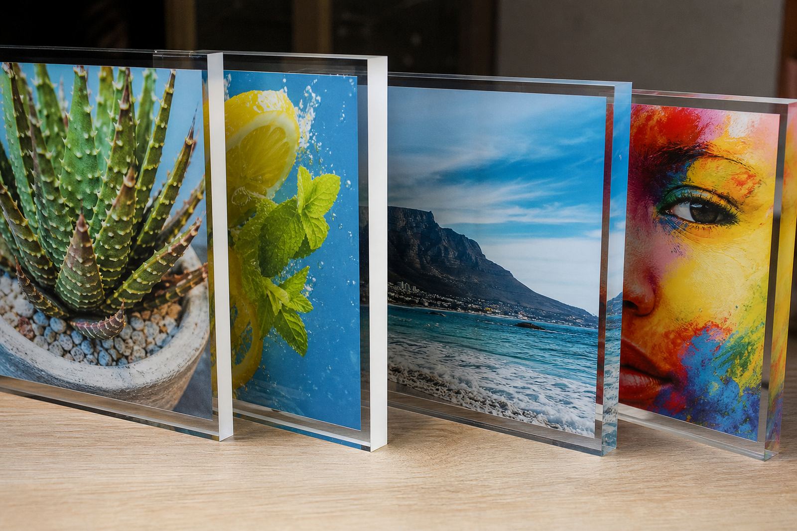
Acrylic is not a flat white board and that matters from the first pass of ink. Clear, frosted and coloured acrylic all react differently to UV printing, so the same artwork can look sharper on one sheet and flatter on another. If you are expecting colour to carry the message, you need to think about transparency, backing colour and where the panel will be viewed from.
On clear acrylic, white ink often becomes part of the design rather than just a background. A print meant for front viewing may need an underbase, while reverse printing can protect the image from scratches and give a cleaner face. With coloured or tinted acrylic, the substrate itself changes the final tone. That is why colour proofs on acrylic should never be treated like paper proofs.
- Check whether the panel is clear, frosted or opaque before setting artwork.
- Decide early if the print will be viewed from the front or through the back.
- Allow for the effect of white ink, especially on transparent panels.
- Ask for a test sample if the job depends on a specific colour match.
Artwork Choices That Help Colour Stay True
Good artwork setup saves time later. Acrylic signage often sits in bright indoor light, behind a window, or in a reception area where reflections can interfere with colour. For that reason, strong contrast usually works better than soft tonal artwork. Fine text, pale greys and low contrast logos can disappear once the panel is backlit or viewed at an angle.
It also helps to prepare artwork with the final fixing method in mind. Mounting holes, stand-offs, edge clearance and safe zones should be planned before print. If the design runs too close to the edge, the finished panel can look cramped or even get damaged during trimming or installation. For shops in Sandton, Midrand or Umhlanga that use acrylic point-of-sale panels, this small detail makes a big difference to the final look.
- Use artwork with strong contrast for busy or sunlit areas.
- Keep important text away from edges and drill points.
- Set colours according to the viewing light, not just the screen.
- Confirm sizing after trimming allowance is added.
Ink, Adhesion and Surface Preparation
UV inks can work well on acrylic, but adhesion depends on the condition of the sheet and the cleanliness of the print table. Dust, grease and static are common causes of weak bond, small pinholes or uneven gloss. Even when the sheet looks clean, a quick wipe with the right method is usually worth the time. In a Gauteng workshop, airborne dust from traffic and construction can settle on panels very quickly, so handling matters as much as the print settings.
Surface preparation must suit the application. Some panels are printed directly, while others are printed on the reverse side so the image is protected by the acrylic itself. If the job is for a humid coastal site in Durban or Gqeberha, the installer should also consider edge exposure and any chance of moisture sitting behind the sheet. Good adhesion is not just about the ink, it is about how the sheet is stored, cleaned and handled before it reaches the machine.
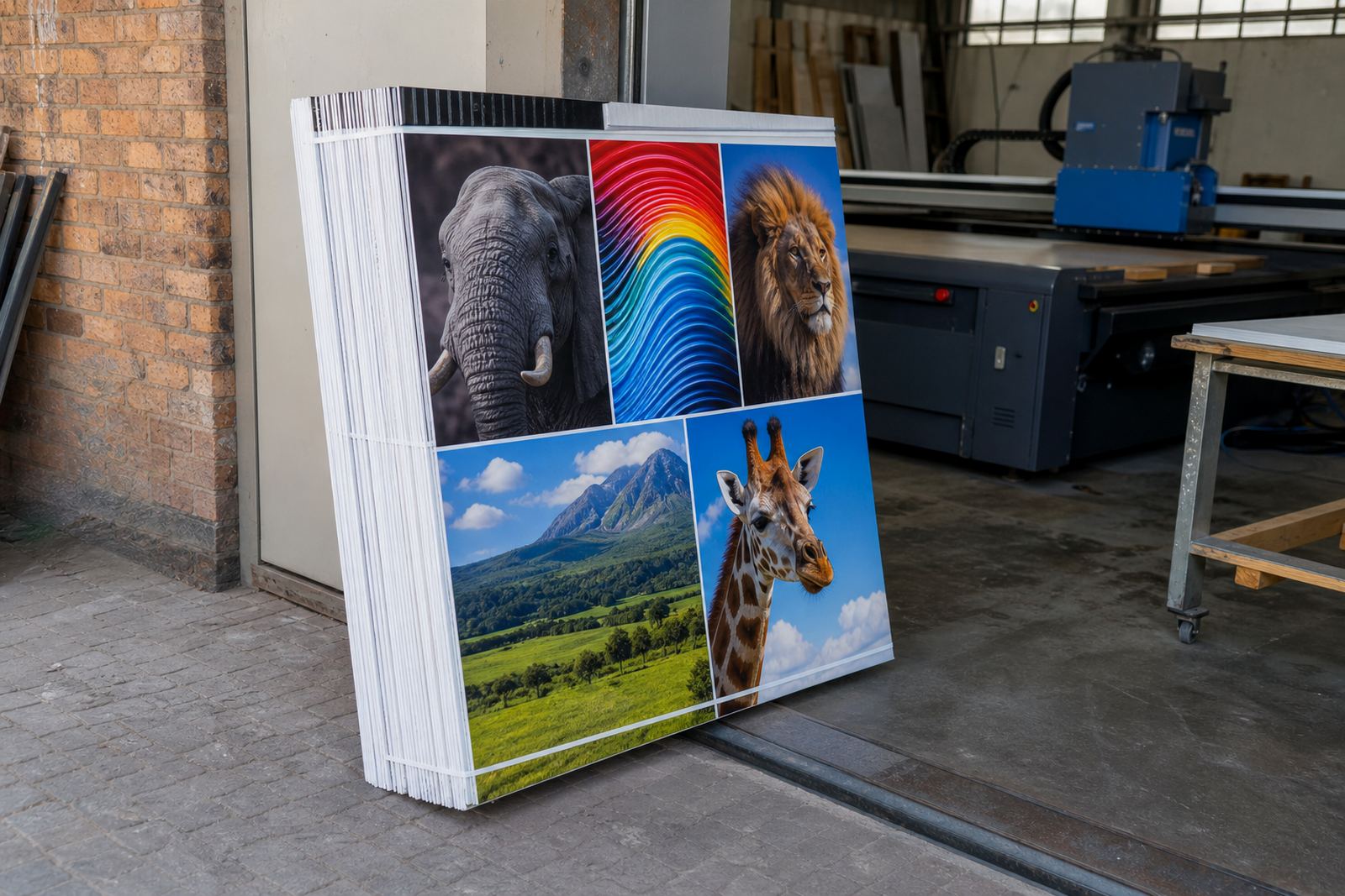
- Store acrylic flat and covered to avoid dust and warping.
- Clean the sheet before printing and avoid residue from the wrong cloth or solvent.
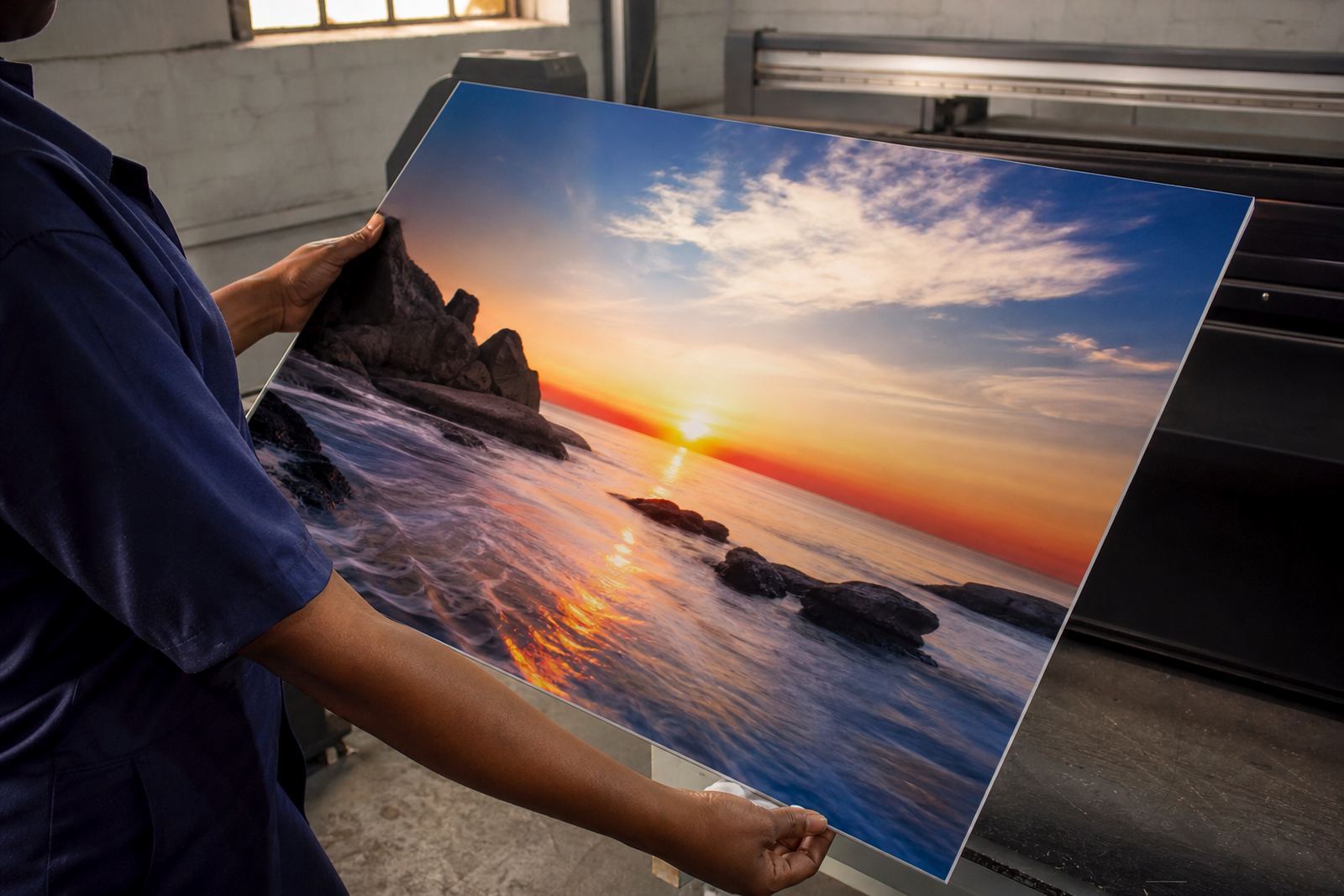
- Handle panels with gloves where possible to reduce fingerprints.
- Check whether reverse printing is better for scratch resistance.
Colour Control Is About Consistency, Not Guessing
Colour on acrylic should be repeatable, especially if the same logo or brand panel will be ordered again later. That means building a proper workflow around test prints, profile choices and ink laydown. A bright red can print well on one panel and look dull on another if the backing, lighting or underbase changes. The key is to keep the method consistent from one run to the next.
For operators, this means setting up a clear routine. Test strips help confirm how colour behaves on the actual material. Production notes should capture which side was printed, what underbase was used, and whether the panel was mounted clear or opaque. That may sound basic, but it saves a lot of rework when a client wants another 12 panels for a franchise rollout in Pretoria, Johannesburg or Cape Town.
- Keep records of material type, print side and ink build.
- Use test strips before a full run on new acrylic stock.
- Note the lighting conditions where the panel will be installed.
- Repeat the same workflow for reorders to keep colour consistent.
Finishing, Mounting and Day-to-Day Wear
Acrylic looks clean, but the finish can be damaged by poor handling after printing. Edges should be smooth, cut correctly and protected during transport. If the panel is mounted with stand-offs, suction, tapes or frame systems, each fixing method should suit the weight and size of the sheet. A receptionist in a Germiston office may only need a small direction panel, while a retail site in the East Rand may need larger wayfinding pieces that must stay straight and clear for years.
Think too about how the sign will be cleaned. Harsh chemicals can mark the surface or dull the print, and rough cloths can scratch the face. For exterior or semi-exterior use, expansion and contraction matter as well, especially on hot days followed by cooler nights. Acrylic can move slightly, so the mounting method should allow for that instead of forcing the sheet hard against a wall.
- Protect the print during cutting, packing and transport.
- Choose fixings that suit the panel size and installation point.
- Avoid abrasive cleaners and rough cloths on the finished face.
- Allow for movement where the panel will face changing temperatures.
A Local Example From Germiston to the Coast
A recent style of job we see often is a retail client needing acrylic menu or promotion panels for several branches, some inland and some near the coast. The same artwork can be used, but the production plan changes. In Germiston, the focus may be on dust control and fast turnaround. In Cape Town or Durban, the installer may also need to think about humidity, handling during transport and how the panel will behave in bright window light. One panel is not just one panel when it has to work in different towns.
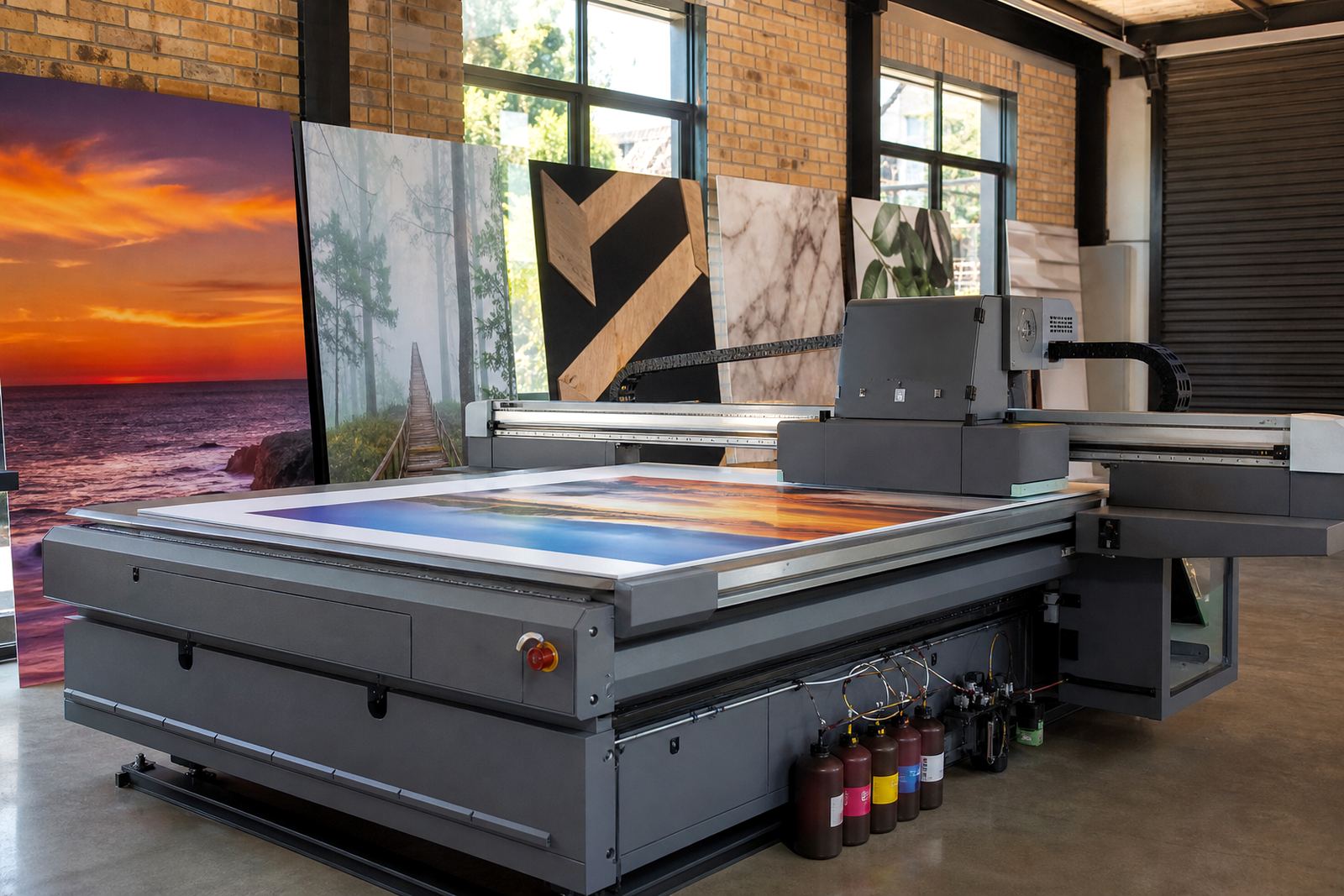
That is why colour on acrylic should be planned as part of a full workflow, from site check to print test to final mounting. If the panel is for a showroom, boardroom or shopfront, the colours must look controlled and the surface must stay clean. For South African businesses, that means choosing a printer setup that can handle rigid boards properly, with the right ink handling, media testing and service support when the production line needs attention.
- Match the print method to the installation site, not only the artwork.
- Plan for indoor light, sun exposure and local climate.
- Keep a sample panel for future colour reference.
- Use the same process for branch rollouts to keep the look consistent.
Getting Better Results on Your Next Acrylic Run
If colour on acrylic matters to your business, treat it as a controlled process rather than a quick print. The right sheet, the right ink build, proper surface preparation and careful finishing all affect the result. Small changes can make a big difference, and poor handling is often the reason a panel looks tired before its time.
For teams that print regularly, it helps to have a clear method for operator training, preventive maintenance and media testing. That way the work stays predictable, whether the job is a single display panel or a larger signage run across multiple branches. Acrylic can look excellent when the process is disciplined and the colour is checked against the actual material, not just a screen.