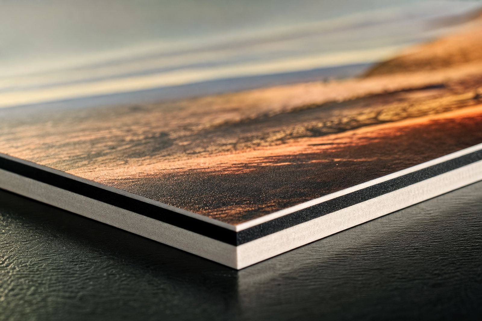
Why Layering Changes the Look of a Board
Flatbed UV printing is not only about putting colour onto a rigid surface. By printing in separate passes, using white, colour and clear in different combinations, you can build a sign that looks more considered and more visible in busy spaces. The effect is especially useful on boards used for retail displays, exhibition graphics, directional signage and point of sale work where the viewer only has a few seconds to notice the message.
Layering works because the print no longer sits flat in the visual sense. A white underbase can lift colour on dark media, while a clear layer can create a gloss highlight or a raised detail that the eye picks up from across a room. On a simple board, that small difference can make the artwork read better under harsh indoor lighting or direct sun at a forecourt entrance. It also helps when the board is seen at an angle, which happens often in passages, foyers and roadside signage.
For South African conditions, this matters. In a Germiston warehouse, a board may need to hold its colour under bright fluorescent light in one week and then go out to a dusty site or a coastal venue the next. Layered print gives the producer more control over how the final piece presents in those changing conditions, and it can do that without making the layout look busy.
Common Layered Effects That Work on Rigid Media
Different layered effects suit different jobs. The key is to match the build-up to the board, the viewing distance and the lighting. A simple retail panel may only need a white base and a second colour pass, while a branded counter panel or feature wall may justify more visible texture. The material choice also matters. Foamex, PVC sheet, acrylic, aluminium composite panel and coated board all respond differently, so media testing is worth the time.
- White underbase: used to brighten colour on dark or transparent media.
- Spot clear: used to highlight logos, patterns or text without covering the whole board.
- Raised texture: adds touchable detail for premium displays and braille-style cues where suitable.
- Layered colour: builds depth in artwork, especially on feature panels and exhibition pieces.
- Gloss and matt contrast: helps separate elements in a design without changing the message.
These effects should not be used just because they are available. A strong sign is still a sign that reads quickly and stays practical to install. If the board will be exposed to handling, transport or loading bay conditions, then the print build must stay within sensible limits so it does not chip or mark before it reaches site.
Planning the Artwork Before the First Pass
Layered printing starts long before the machine runs. Artwork needs to be set up with the print order in mind, not just the final visual. That means separating the layers properly, checking knockouts, confirming clear varnish areas and making sure text remains readable once the highlights are added. If the file is not prepared carefully, the effect can look uneven or muddy instead of crisp.
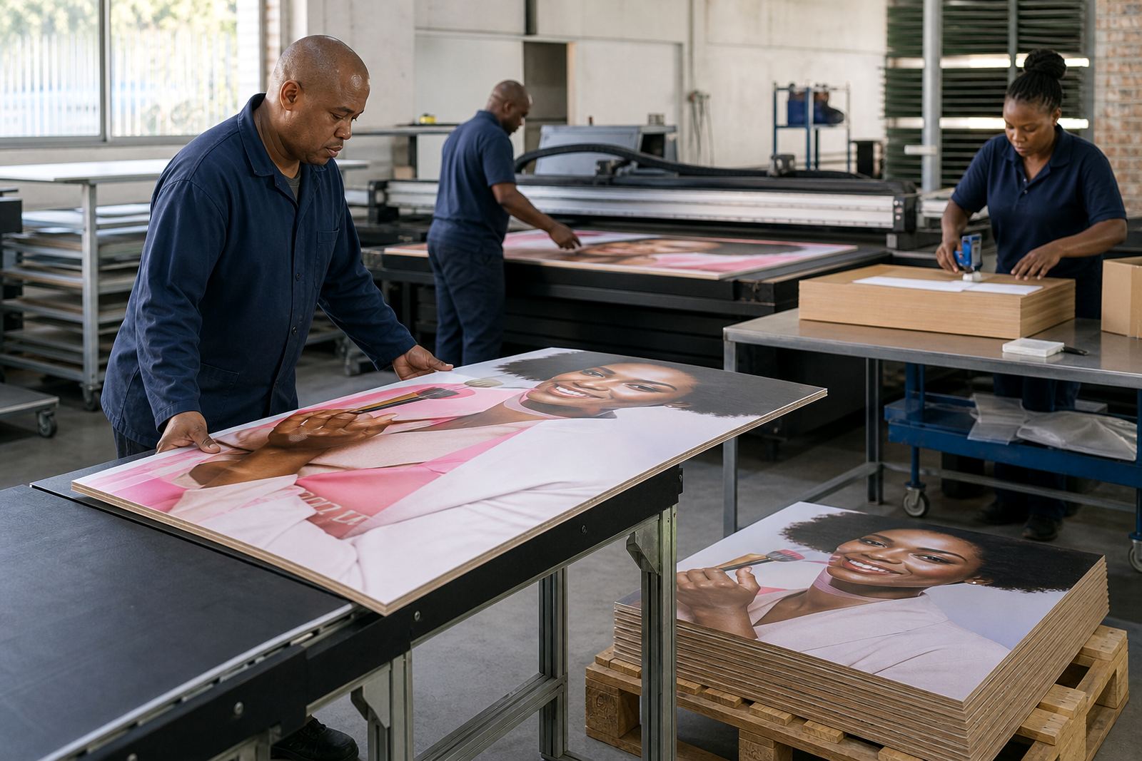
Good workflow planning also saves time in production. A shop that handles layered UV work regularly will usually set aside proofing time, colour guidance and media checks before committing to the full run. That is especially useful when the job includes mixed board sizes, variable finishes or a new substrate that has not been tested before. In our experience, a quick check on one sample can prevent wasted sheets and delays later on.
- Confirm the final board size and trim allowance before layout starts.
- Separate each print layer clearly in the artwork file.
- Check how the design will look under indoor light and daylight.
- Test adhesion on the actual board, not only on a similar sheet.
- Allow for curing, handling and packing time in the schedule.
A Practical Example from a Gauteng Retail Site
Consider a retail supplier in East Rand Support area that needs fascia boards and internal promotional panels for a store refit. The client wants the branding to hold up in a mall passage with strong overhead lighting, plus a window-facing display that will also be seen from outside. A single flat print could do the job, but the message may flatten out when the light shifts during the day. Layered UV gives more control over the finish.
A white base can be used where the board is darker, while selective clear can lift the logo and key words. If the display includes product categories or directional arrows, those can be kept matt for legibility and the brand mark can carry a gloss highlight. That separation helps the customer understand the display faster, even when they are moving past it. It also gives the installer a cleaner final result, because the board arrives ready to mount rather than needing extra finishing on site.
In Gauteng, where load-shedding can still disrupt production schedules, a clear workflow matters. Jobs that require layered passes need proper planning around curing, machine uptime and finishing order. When the board is planned correctly, the shop can keep production moving and still deliver a sign that looks more complete than a standard single-pass print.
Choosing Media That Holds the Detail
Layered effects are only as good as the board beneath them. Smooth, stable media gives the cleanest result because the print head lays down ink more evenly and the clear or textured layer sits where it should. Rough or flexible surfaces can distort the effect, especially on fine text or small highlights. This is why media testing is part of the process, not an optional extra.
For signage that will be exposed to sun, humidity or handling, it is worth matching the media to the site conditions. Coastal work in Durban or Gqeberha may need a different approach from an indoor board in Pretoria. If the sign will live near an entrance, parking area or service counter, the surface should also be easy to wipe down. That simple choice can save the client repeated maintenance and keep the print looking sharp for longer.
- Use rigid media with a stable surface for the cleanest layered detail.
- Check adhesion and curing on every new substrate.
- Match the board finish to the lighting at the installation site.
- Choose materials that can handle transport, fixing and day to day cleaning.
When to Use Layered Effects and When to Keep It Simple
Not every job needs visible layering. A clean flat print is still the right answer for some wayfinding boards, temporary notices and high-volume promotional work. Layered effects make the most sense when the sign needs to be noticed quickly, viewed at close range or presented as a higher-value piece. If the content is crowded already, adding too many print effects can reduce clarity.
A practical rule is to use layering where it improves legibility or creates a clear hierarchy. That might mean a raised logo on a reception panel, a gloss title on a directional board, or a white base under a dark brand colour on rigid signage. For everything else, keep the finish simple and let the layout do the work. The best result is usually the one that helps the message land without drawing attention to the print process itself.
For suppliers working across South Africa, from Germiston to Cape Town and beyond, this balance is what makes layered UV printing valuable. It gives more room for visual impact, but it still needs practical planning, good installation and proper support after the job leaves the workshop.